The Data
The data comes from the player statistics on NHL.com. I filtered the Bios report for just US born players. Some of the players included in the list might be two way players that do not play solely in the NHL. The list does include players who have played at least one game in the NHL this season.
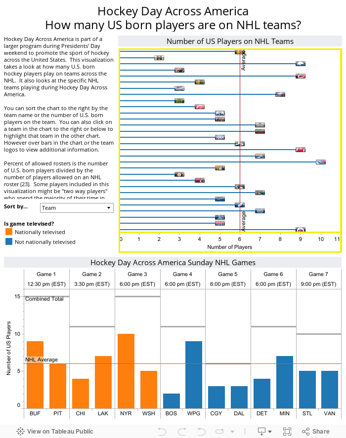
The Design
The design is straightforward without a lot of interaction. I chose a lollipop chart as opposed to a traditional bar chart because of the size restrictions for the viz. This type of chart allowed me to be able to remove the Y axis with the team names. Instead, of a traditional circle at the end of the line, I used the team logo "jewel" to identify the team. One element of interaction is the ability to sort the lollipop chart by either the team name (for ease of locating your favorite team) or by the number of US players (to easily identify the team with the most US players).
The Result
As you can see, 5 of the top 10 teams for US born players are playing today. Most of the teams playing in nationally televised games are at or above the NHL average for the number of US born players on a team. In fact, out of the 7 games today, the three nationally televised games have the most US born players on the teams' rosters. NBC and the NHL should be commended for featuring games that have the potential to highlight the most US born players playing on the nice today.
View additional hockey related data visualizations that I have created.
No comments:
Post a Comment